Compose your design system in minutes
Generate a connected foundation of tokens, UI packages, configuration, builds, tests, and optional Storybook. Then develop your design language and components.
ds-gn create design-system sets up a Lit workspace with an atomic structure: tokens and UI packages, shared configuration, builds, tests, and optional Storybook. With Bun and CLI access set up, you can generate that connected design-system foundation in minutes, then develop your design language and components within it.
Build on a connected design-system foundation
Starting a design system means deciding how tokens, packages, styling, builds, tests, and documentation work together. Those decisions matter, but wiring the foundation together is repeatable work.
The CLI does that setup in one flow. Choose your language, styling approach, element prefix, and package scope. It generates the workspace and records the choices in ds-gn.config.json. The token and UI packages share a build workflow, and each component you add follows the saved configuration.
That saves setup work at two points: when you start the system, and whenever you extend it with another component. Your team can work on the design language, component behavior, and consuming product with the package structure and supporting tools already in place.
Watch the creation wizard
The walkthrough below starts with ds-gn create design-system, shows the setup choices and generated configuration, then adds a component using those settings.
Get early access. Join the email waitlist and confirm your address for a chance at early access. Joining doesn't guarantee access; launch timing and pricing are still to be announced.
The demo covers scaffolding. Next, install dependencies with your registry access configured and run the build.
Run the design-system creation command
From the directory where you want the new workspace, run the installed CLI:
ds-gn create design-systemThe initializer entry point is bun create @ds-gn-cli ds. Both route to the design-system creation wizard. The CLI packages use a restricted registry today, so these commands require the appropriate registry setup and entitlement. A waitlist submission is not registry authorization.
Choices in this recording
The wizard normalizes the tag prefix with a trailing hyphen. It also normalizes an entered scope with a leading @. In this flow the generated configuration additionally records framework: lit, structure: atomic, and publishMode: multi-export-package.
Inspect the generated configuration
cd demo-ds
cat ds-gn.config.json
The CLI writes ds-gn.config.json from your selections. It keeps the workspace decisions in one place, so adding another component does not require repeating the setup.
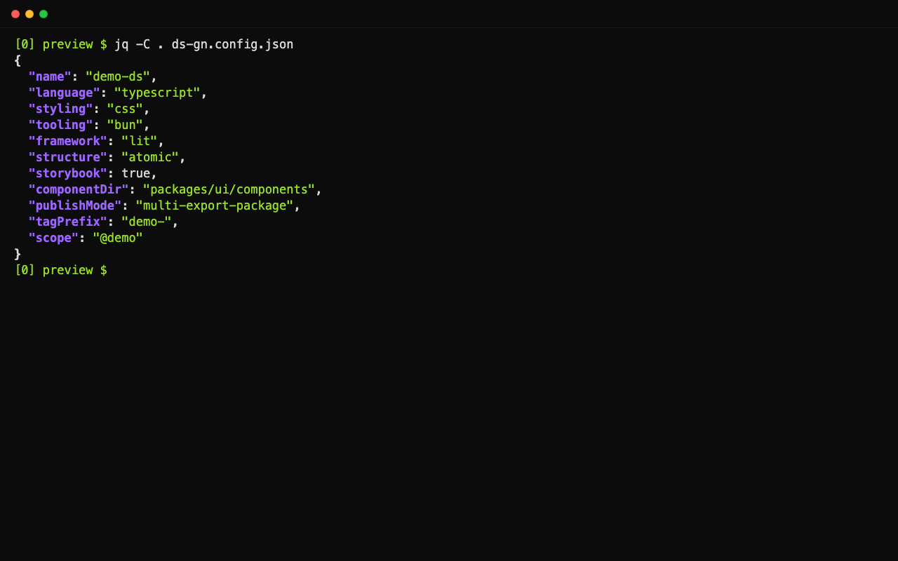
This preview uses TypeScript, plain CSS, Bun, Storybook, the demo- element prefix, and the @demo npm scope. The current wizard creates a Lit workspace with an atomic structure. It requires Bun 1.4.4 or later.
Add the first component
From the generated workspace root:
ds-gn create component StatusBadgeChoose Component at the type prompt. The CLI creates packages/ui/components/StatusBadge using the saved language, styling, and prefix decisions. Its story, starter tests, and exports arrive with the source file, giving you the supporting files to develop and check the component together.
Files created for this configuration
The configured prefix gives the element the name demo-status-badge. The generator also adds ./status-badge and ./status-badge/props exports to the UI package, pointing to build output. Those entries do not mean the output has already been built.
Why we chose Bun
We chose Bun for speed and a smaller toolchain. Its built-in tools cover several jobs that commonly require separate packages. That means fewer development dependencies to install, configure, and keep in sync before you start building components.
Bun is open source and MIT-licensed, and Anthropic acquired Bun and committed to continued investment. An inspectable codebase and an organization investing in its development give us confidence in choosing Bun for tooling we expect to maintain for years.
Jobs covered by Bun
The scaffold uses Bun's test runner and bundler for its component workflow. The same Bun installation also includes formatting, so you can format the workspace with bun fmt without installing Prettier separately.
For this workspace, Bun's filters and package scripts cover basic task execution. Teams that need Turborepo's shared build cache or Lerna's package versioning and release workflow can still add those tools. The Lit CSS plugin, Storybook, and TypeScript declaration tooling remain specialized parts of the generated workspace.
Keep builds and tests in the development loop
The generated scripts connect the build and test steps to your workspace, including preparing component CSS before the tests run.
After creating the workspace, install its dependencies with your registry access configured:
bun install
bun run build
bun run test
For the workspace shown here, the UI watch script rebuilds a component when you edit its TypeScript source. That keeps routine edits focused on a smaller build. To run it from the workspace root:
bun run --cwd packages/ui watchIf you selected Storybook, start it alongside your component work:
bun run storybookThe story gives you a place to inspect states; the tests give you a place to check behavior. That gives you a working feedback loop for component APIs and interactions, with the build and test wiring already in place.
Work toward a first release in days
The aim is a focused first design-system release in days. Start with the components your first consuming product needs, give each one a story and behavior tests, and use the generated build commands to produce its package output.
The CLI removes repeatable setup from that path. Your team can put its time into the design language, component states, accessibility, and integration with the product. As the system grows, the same component command keeps new additions consistent with the workspace.
For StatusBadge, that means deciding its states, text, accessible naming, and whether changes need announcing. Add those states to the story and extend the starter tests before using it in a product.
The generated component starts as a slot-and-label shell. Its tests check basic rendering and registration; they do not establish accessibility or cover your status semantics.
Further reading
- Get early access by joining the email waitlist to hear when access is available.
- DS-GN's public packages and component approach.
- Explore the DS-GN documentation.
- Lit documentation — the component framework used by the generated workspace.
- Bun documentation — installation, builds, tests, and formatting.
- Storybook documentation — developing and documenting component states.