Introducing DS-GN: web components and tokens you can install today
What DS-GN is, the two public packages you can install without an account, and the shortest path from an empty project to a themed component.
DS-GN — pronounced "design" — builds UI components and design tokens for engineers and design-system maintainers. Every team rebuilds the same buttons, inputs, and type scale; we want that work to start from a shared, well-tested foundation instead.
This blog is where the people building DS-GN write about how it works. Posts ship with code you can run. This first one covers what you can install today, and how to get from an empty project to a themed component.
What you can install today
DS-GN publishes two packages to public npm. Neither needs an account, an entitlement token, or a custom .npmrc.
@ds-gn/ui— 26 web components, built with Lit and exposed as standard custom elements, with generated React wrappers. They work in plain HTML, React, Vue, Svelte, Solid, or anything else that can render a tag.@ds-gn/tokens— the color, typography, spacing, radius, and shadow tokens the components consume, as CSS variables and Tailwind theme values.
Both are in Public Beta. While they remain 0.x, patch releases do not intentionally break documented APIs, and planned breaking changes ship in a minor release with migration guidance.
From install to a themed component
Install the packages
Install the tokens package explicitly, even though the components depend on it — your application imports its stylesheets directly. lit is a peer dependency; most package managers install it for you.
Load the tokens
Import all three token stylesheets, once, in your entry stylesheet:
@import '@ds-gn/tokens/public';
@import '@ds-gn/tokens/theme';
@import '@ds-gn/tokens/properties';- public is the override API — every token you are allowed to redefine.
- theme maps those tokens to their light and dark values.
- properties registers the typed custom properties the components depend on.
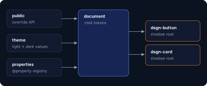
A shadow root cannot register @property — only the document can. Without the properties import, declarations that read those tokens are dropped at computed-value time. Nothing errors, and most of the component still looks right.
Import a component
Importing a component module registers its custom element. Nothing is registered globally on your behalf, so you ship only what you use.
import '@ds-gn/ui/button';<dsgn-button appearance="solid">Get started</dsgn-button>Rebrand with two custom properties
The public layer is the contract. Redefine a token there and every component that reads it follows — in light and dark — without touching component code.
:root {
  --brand-on-light: var(--color-indigo-500);
  --brand-on-dark: var(--color-indigo-400);
}Public tokens are covered by the 0.x compatibility contract. A component's internal markup is not public API.
Coming from LightLeap
The packages moved from @lightleaplabs/ui and @lightleaplabs/tokens to @ds-gn/ui and @ds-gn/tokens, and lll-* elements are now dsgn-*. Published LightLeap versions remain installable. The migration guide has before-and-after examples.
What comes next
Our longer-term direction is design system orchestration: compose a system from a canonical core, then customize it with language, styling, and tooling adapters. The @ds-gn-cli/create CLI that does this is coming soon — join the waitlist for availability updates.
On this blog, upcoming posts go deeper into the pieces this one skimmed:
- How the token build emits Tailwind
@theme, public CSS variables, and shadow-DOM variables from one source. - Why our components register their own elements, and how that keeps bundles tree-shakable.
- How we certify each Public Beta component for accessibility before it ships.
Until then, the documentation covers setup and every component's API, Storybook shows each component live, and the changelog tracks every release.